Nano Consulting
Nano Consulting is a mock marketing agency, offering a range of services from bespoke positioning and marketing strategies to in-depth branding and design work. I took on this logo design as a personal project and deep dive into color, form and use of negative space.
Logo Design
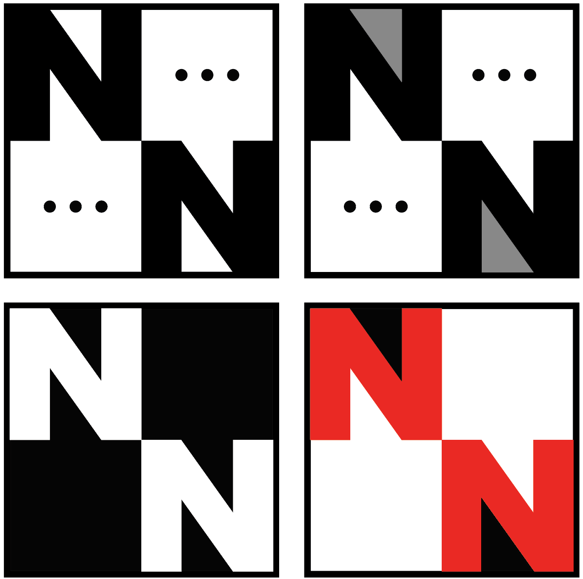
The concept that initiated this design was the combination of N’s, the two founders initials. I devised a logo based around the intersection of these letters, strategically utilizing negative space to form speech bubbles, signifying the company’s core value of clear, effective communication.
Concepting
Pictured below are my initial sketches and color palette selection as well as further along iterations trialing various grayscale combinations and fine tuning detail work.